Dear Moderator
This is a message to tell you that i have finished my coursework to the best of my ability. This project was all done by me and didnt have any unsuitable help from students or staff.
Jack Bowering
Monday, 25 March 2013
Evaluation Question 3!
Q3-What have you learned from your audience feedback?
After we completed our rough cut we received some
feedback from the audience:
1. they said it needed more variation within the shots
2. it also was the correct Mise-en-scene
3. Costume was accurate to genre
4. Location was suitable
5. Lighting could have been improved
6. Lip sync could have been improved
7. Obvious genre representation
8. Good quality sound
Before we received this feedback we
researched what our target audience would be by going round and interviewing
several people and asking them some simple questions.
My audience feedback is fairly
accurate and to the point it has given us an insight into what we needed to do
to improve our work to make it a sufficient standard and a good clear music
video. By using their knowledge it made are jobs of clearly showing of the
genre easier and less of a struggle.
The responses of people that don’t follow
the indie rock genre differs from those who follow it for example a pop music follower didn’t understand why
the video was so simplistic and basic but that because there music follows a
bright and expensive story that is very visual. What the audience said
clarified our idea of what the genre would be so that the original target
audience we started with was actually correct and that we had set out with the
right gender and age group.
Evaluation Question 1!
Evaluation question 1
-In what ways does your media product use, develop or
challenge the forms and conventions of real media texts?
All media products follow a trend of forms and conventions. My A2 media
production follows this principle. This
year I created a music video based on the song ‘I bet you look good on the dance
floor’ by ‘Arctic Monkeys’ the genre largely decides the conventions and forms
used in music videos so for mine the genre would be indie rock which contains a
lot of specific conventions. For example:
·
Casual
dark clothing
·
Performance
aspects
·
Shadows
·
Little
movement within a shot
To find out about the different conventions
and forms of indie rock I watched several different bands and how there videos
differed from the Arctic monkeys song, from this research I found out the key
aspects.
In my video I included several key aspects
that I found but also I didn’t agree with all of the convention and felt that
the genre needed a new identity, so perhaps like a pop song I linked narrative
with performance. For the video I started with performance scenes and I also
had performance for the chorus. I also looked at other genre so I could challenge
the normal conventions associated with the indie rock genre. Not only did I
take the narrative aspect from the pop genre but I also was influenced by the
rock genre and used a simple lighting scene that emphasised the setting.
 Next I looked at different theorists and their
view on form and genre for example Andrew Goodwin was a theorist that I looked
at a lot of the time. One of his key aspects was to link the lyrics to the
images so I saw this and challenged it. So I added a clip from a dance
completion when the corresponding section of lyrics appeared. Another one of
his key ideals is that there is lots of close ups on the lead vocalist which I
believe really helps identify the genre so I thought it was required in my video,
therefore on the performance aspect of the video I added several close ups and
therefore used the pre-existing convention.
Furthermore we saw that another key aspect is that there is only ever
performance and narrative so I felt I would maintain his theory and follow this
aspect, I also felt it corresponds to other indie rock music videos.
 Thursday, 21 March 2013
Inside cover!
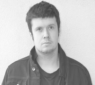
I created the inside cover of our digipak, i felt the inside cover may not be the most seen but has hugh importance and i thought as one of the main principles of Andrew Goodwin's theory (who i have been looking into) was to focus on the lead role i felt it should be based around the lead.
We first chose this image because i felt it showed off the genre well and it further emphasised the simplistic nature of indie rock. However i thought it needed to be improved so i then chose to focus upon the face and upper body of the lead, also to convert it to black and white to add a more retro look which goes along with the song lyrics.
Above is the completed inside cover if i were to do it again i would have an image that came up more frequently as to relate it to the album more effectivly.
We first chose this image because i felt it showed off the genre well and it further emphasised the simplistic nature of indie rock. However i thought it needed to be improved so i then chose to focus upon the face and upper body of the lead, also to convert it to black and white to add a more retro look which goes along with the song lyrics.
once i had completed this i thought it just needed one thing which was a title but as the viewer would already have bought this product the title need not be massive and fancy so i chose a simple small image to be placed within.
Magazine cover evalulation!
Good:
our advert clearly shows our genre and style of the music video, it links into all of our previous work and the style we first wanted to achieve. The image maintains the same colour as the digipak so the audience will sub-counciously acknowledge it. Furthermore our reviews are from logical companies known to give reviews to our genre of music.
Bad:
our advert does not have a large amount of reviews so the audience may feel it is not as great as it could be as it doesn't give enough feedback from famous brands. The image is not from our video and therefore isn't instantly recognisable.
If i were to do it again:
If i were to do it again i would change the image to an image within the video so the audience can relate to the video with ease. Furthermore i would change the title as i feel it doesn't match the genre entirely. next i would add more reviews from possible franchises.
Tuesday, 12 March 2013
Subscribe to:
Posts (Atom)


